ZRO
Services
Brand strategy and identity
Impact
- Delivered positive societal change
- Global expansion
Story
Keeping food as food is ZRO’s driving mission. A mission that was born from the innovative team behind Choc Nibbles – a confectionery product that transforms broken biscuits and chocolate misfits into a delicious snack. ZRO is capitalising on the success of Choc Nibbles product as a proof point of the system and taking it into a full B2B service offering that helps manufacturers, retailers and suppliers unlock value from surplus food.
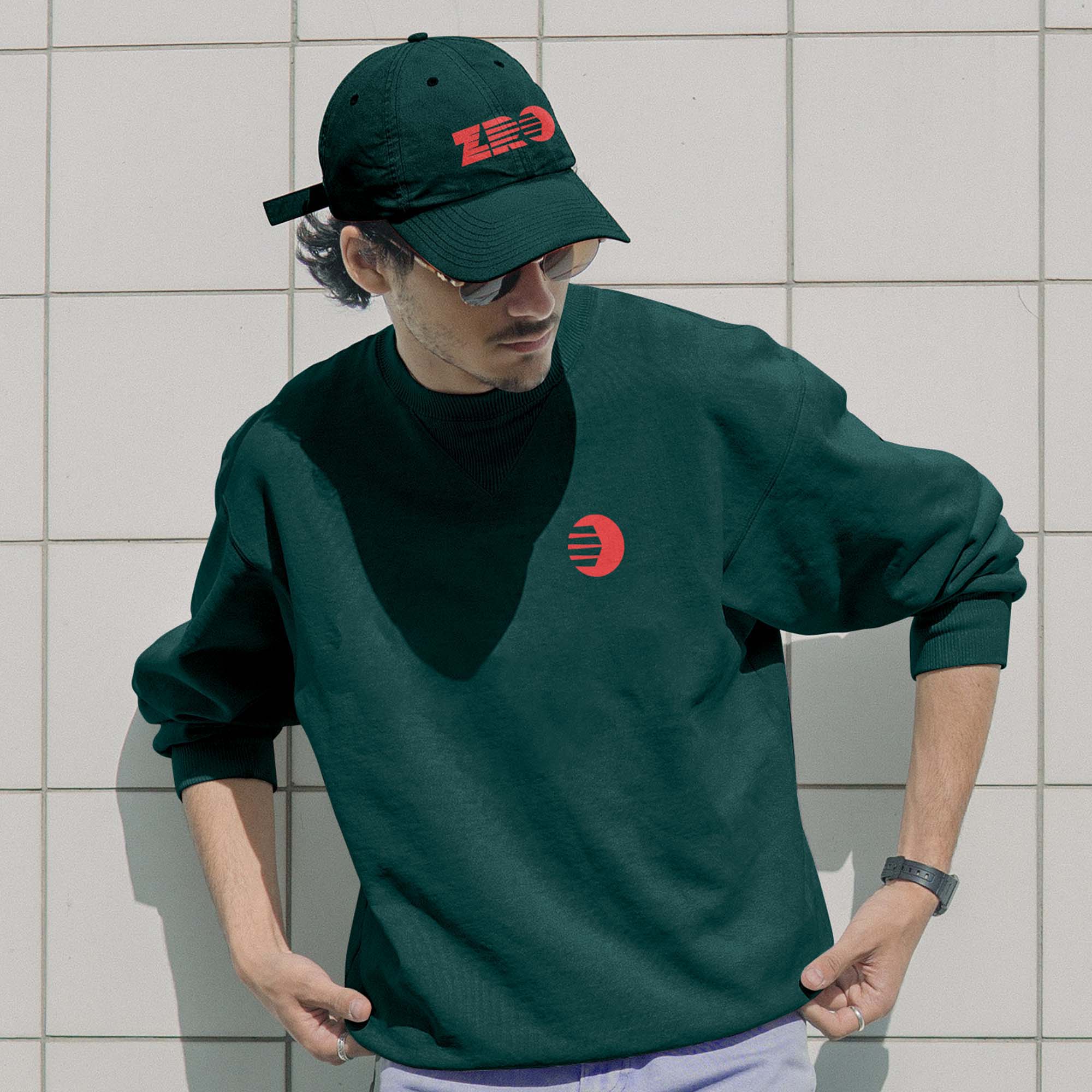
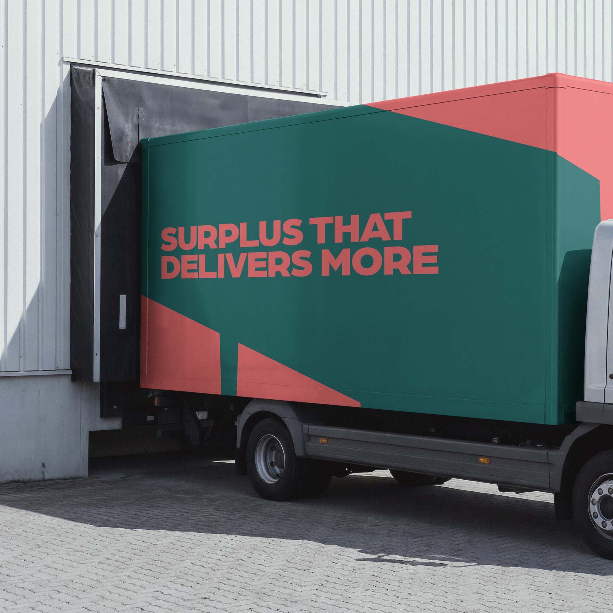
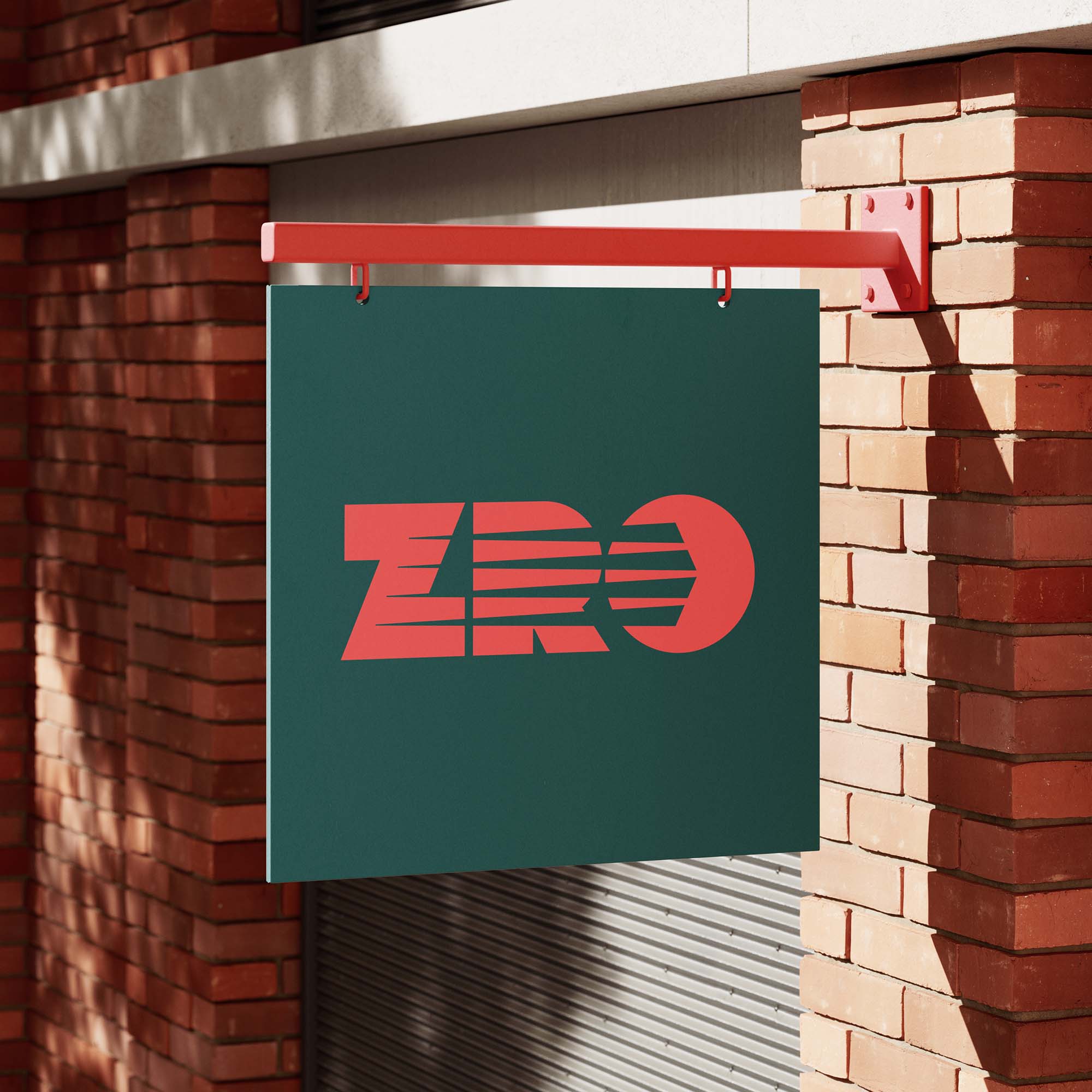
The name ZRO reinforces the ambition to drive down waste and emphasised visually within the directional nature of the logo and use of the linear devices in the wider identity system.
Central to the design is a clear articulation of ZRO’s offer and how the solution adds value at all levels of the food waste hierarchy – making it easy for audiences to understand, trust and buy-in. We translated this into a distinctive infographic and animation to clearly communicate the multi-level benefits with existing and potential partners.
We developed content for the core brand pillars and tone of voice – ensuring the brand’s point of view cuts through the complex world of food surplus.
This is just the start of ZRO’s journey and we’re still working together to support the brand rollout, with filming and an impactful pitch deck and further projects in progress.