Ringtons
Services
Brand refresh, packaging design
Impact
- Brand evolution
- Business growth
- Iconic heritage brand
Story
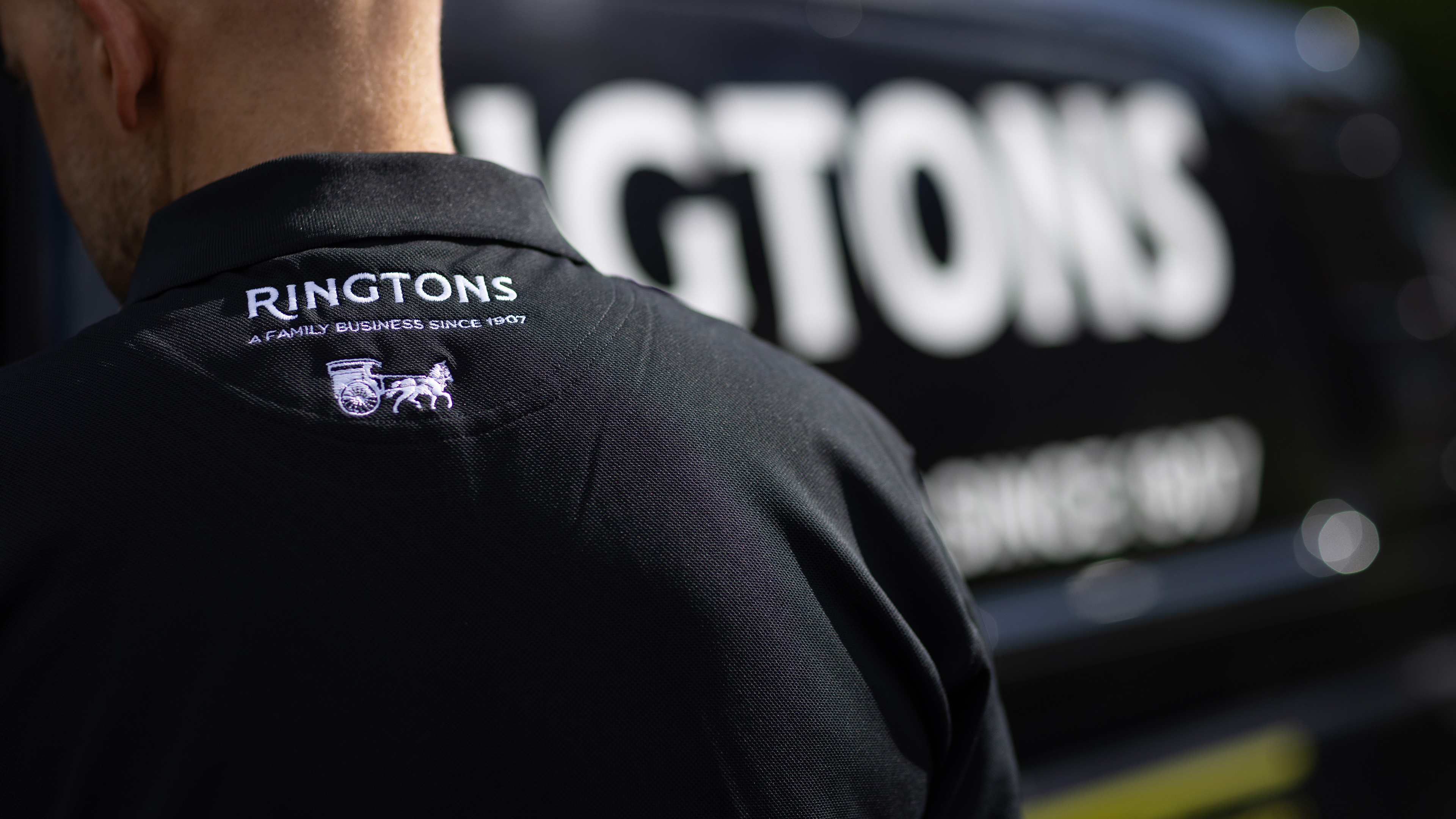
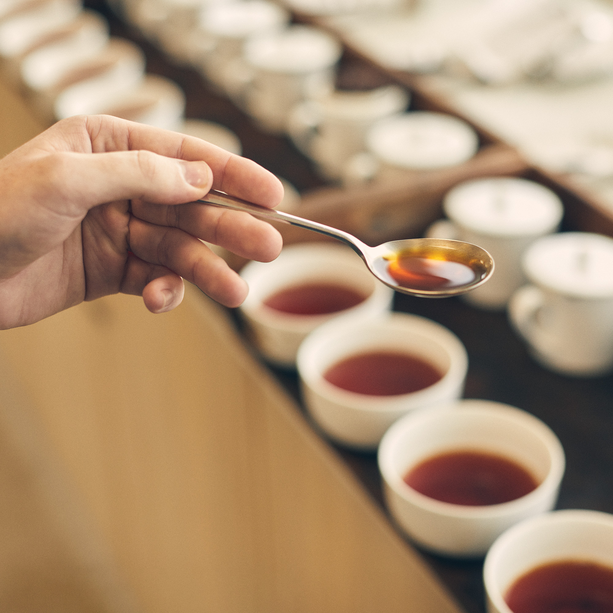
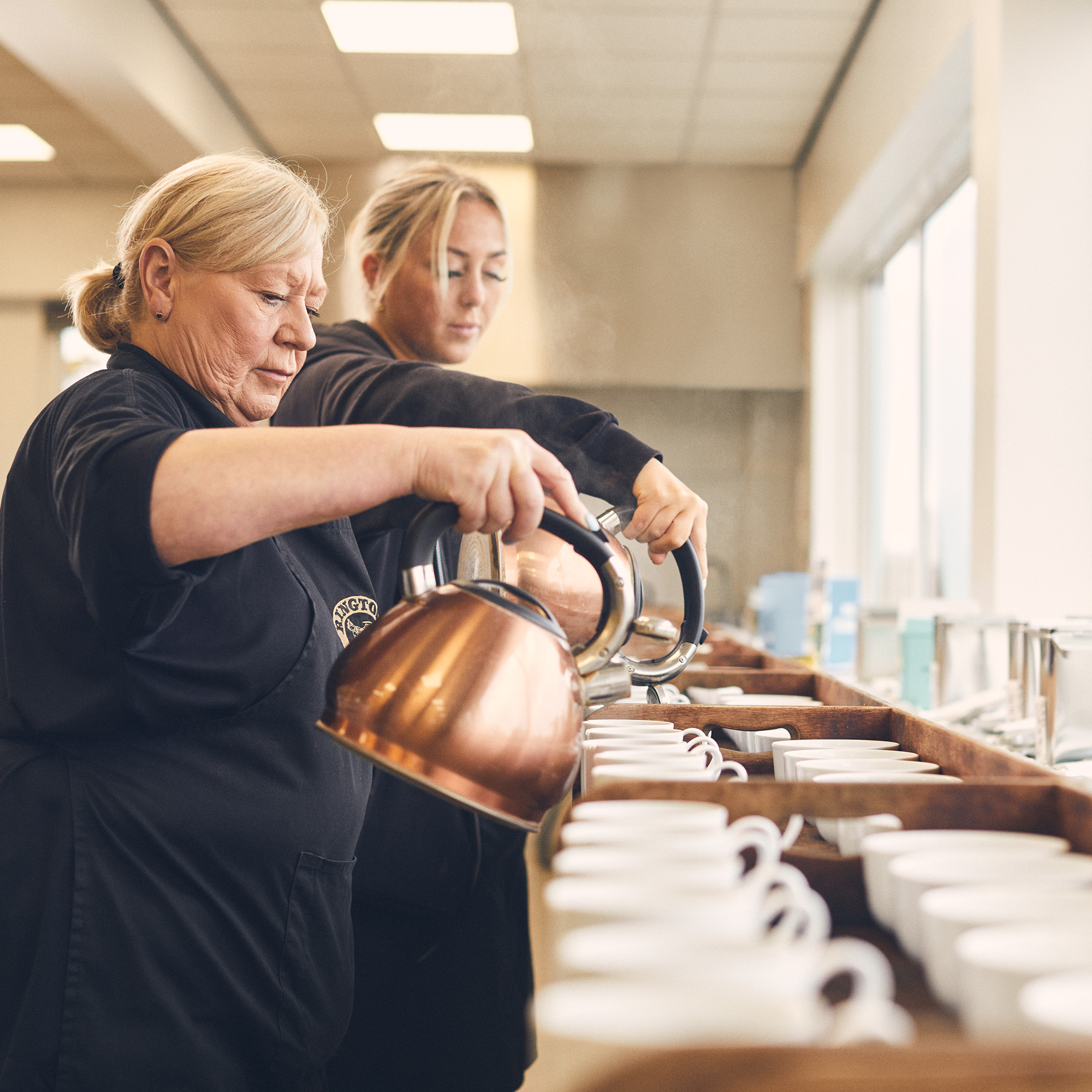
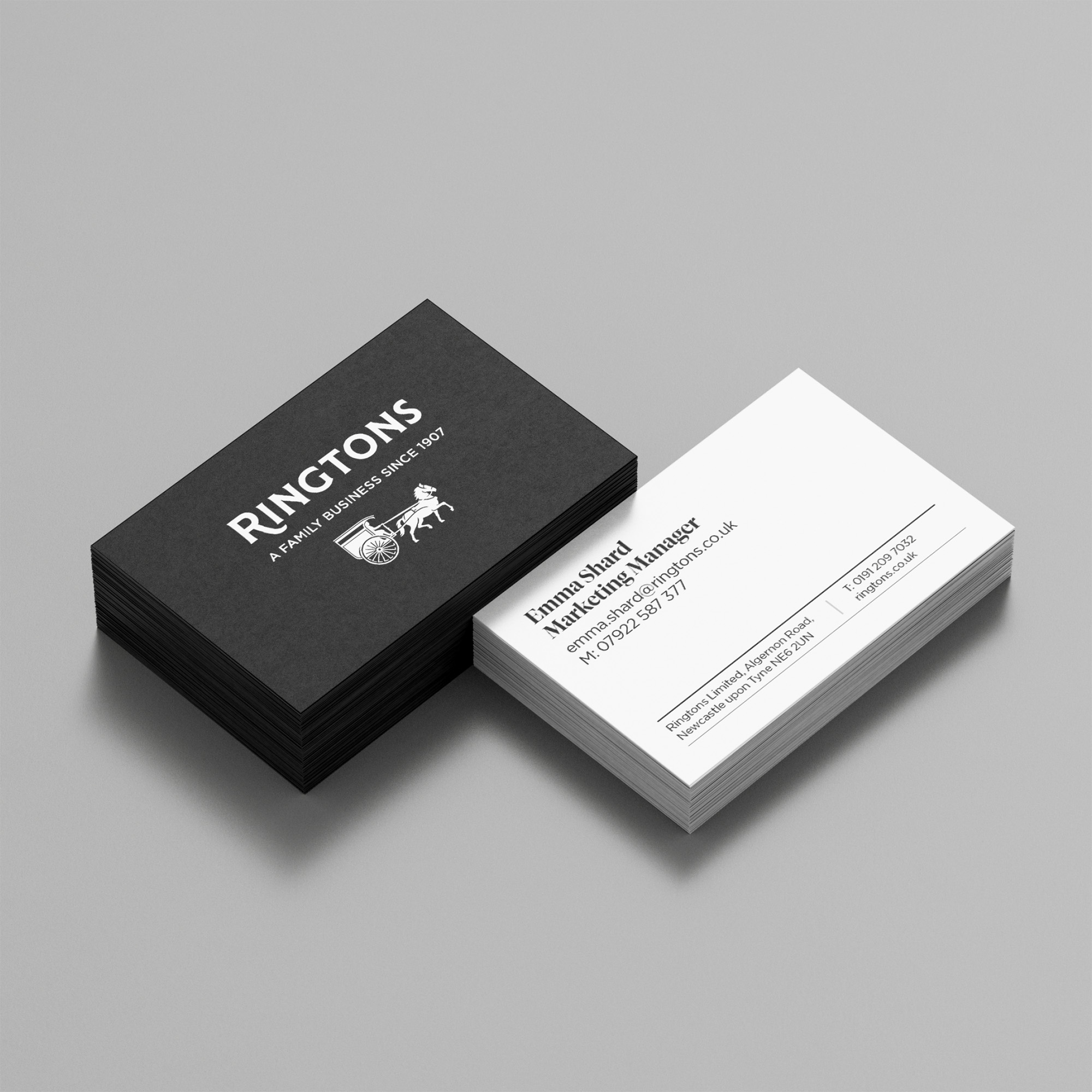
Ringtons’ quality and friendly service has made them a household name to generations of North East families. As the brand has grown its offer in the D2C and B2B markets, the family identified a need to bring greater cohesion to how the brand shows up, regardless of sector or product. They approached us to help create a brand identity to support their evolution.
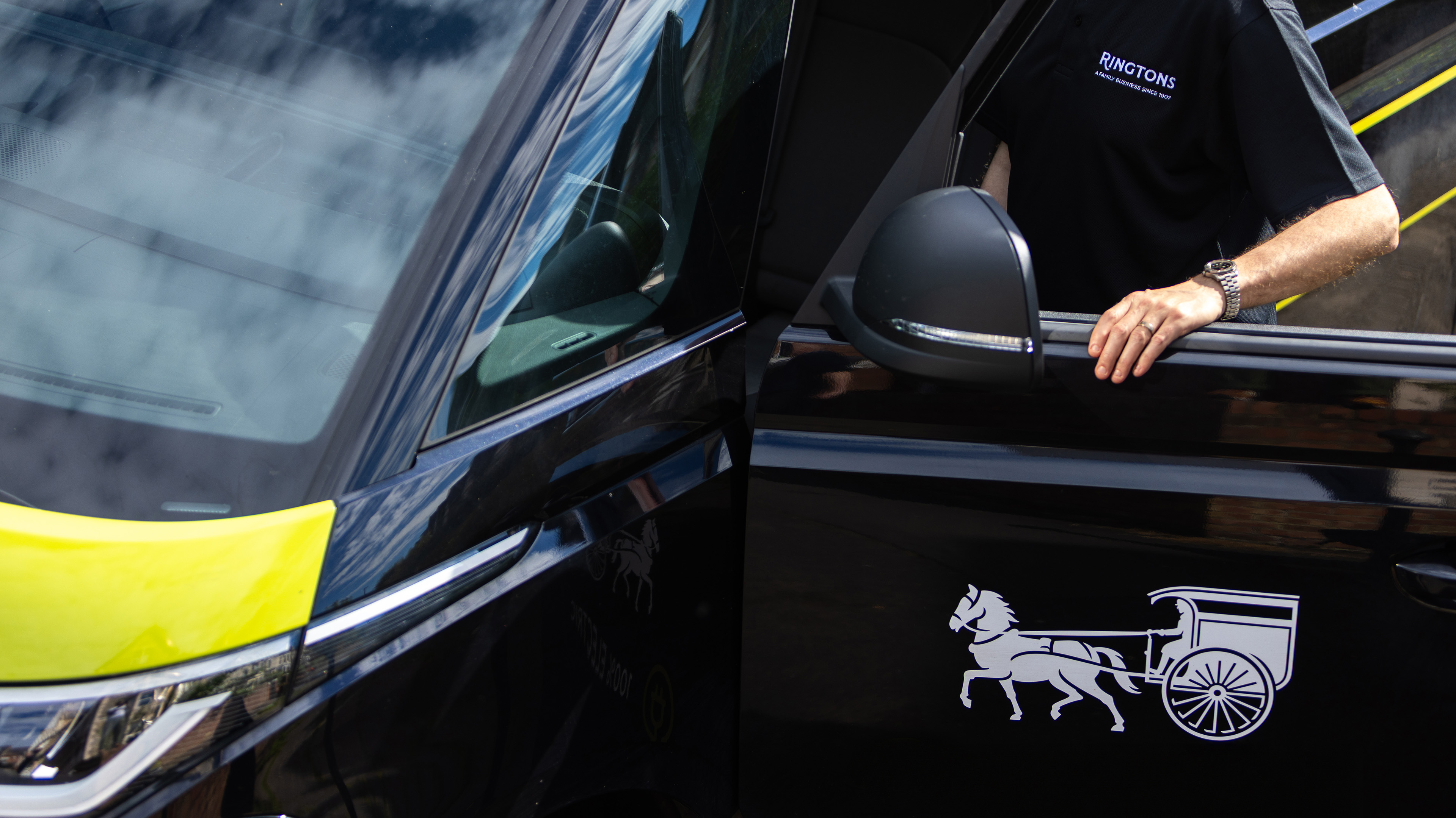
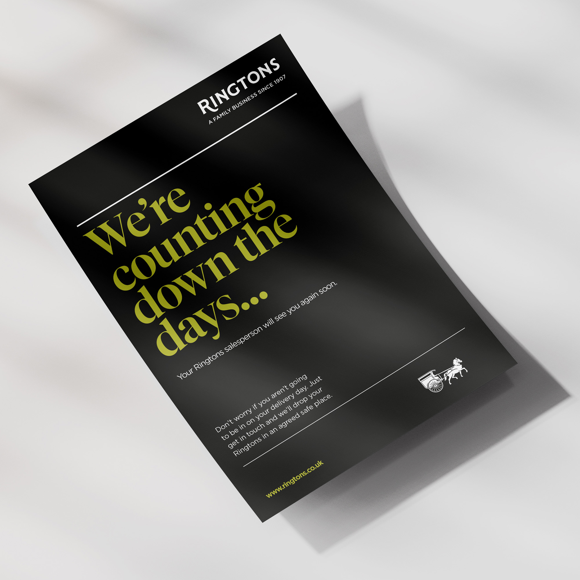
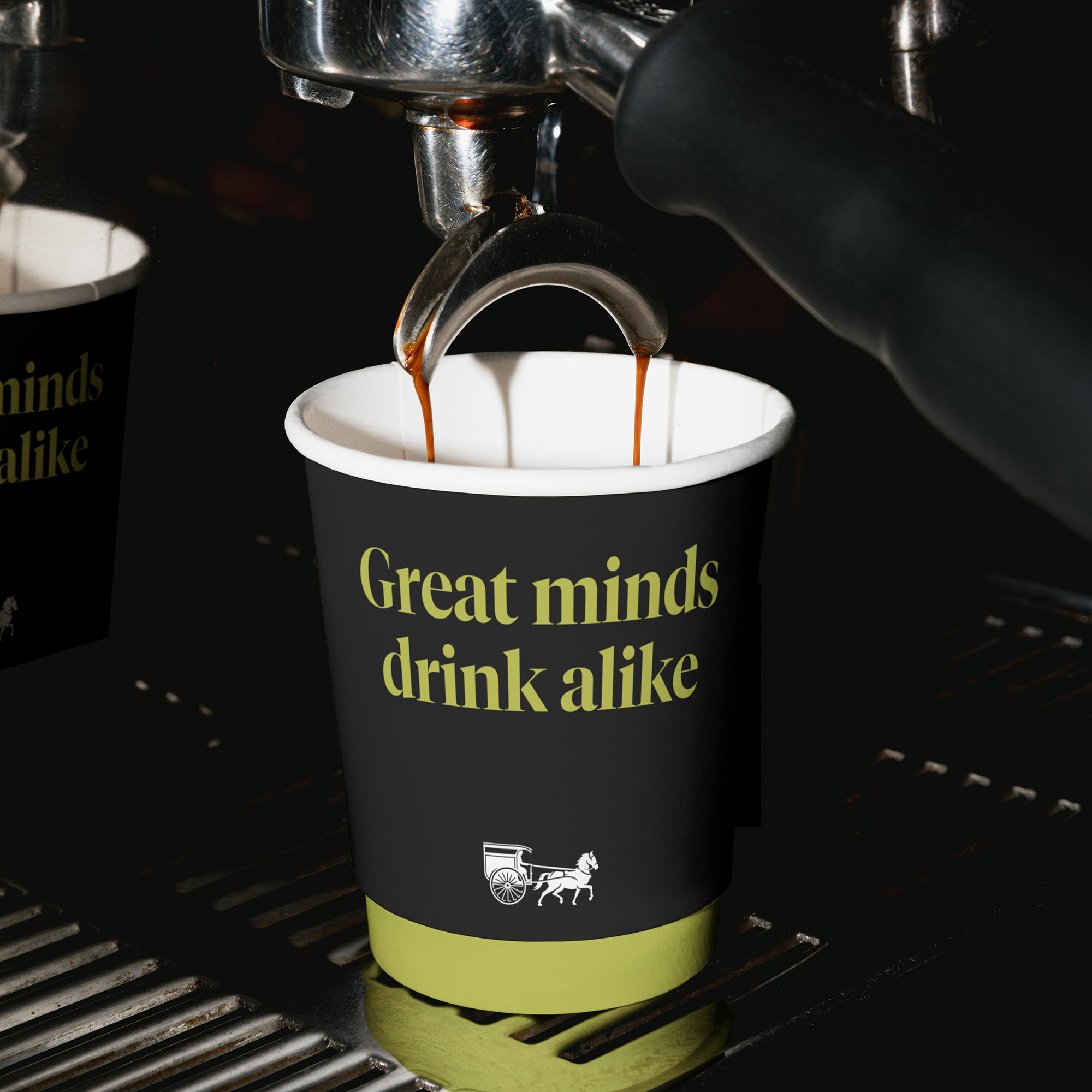
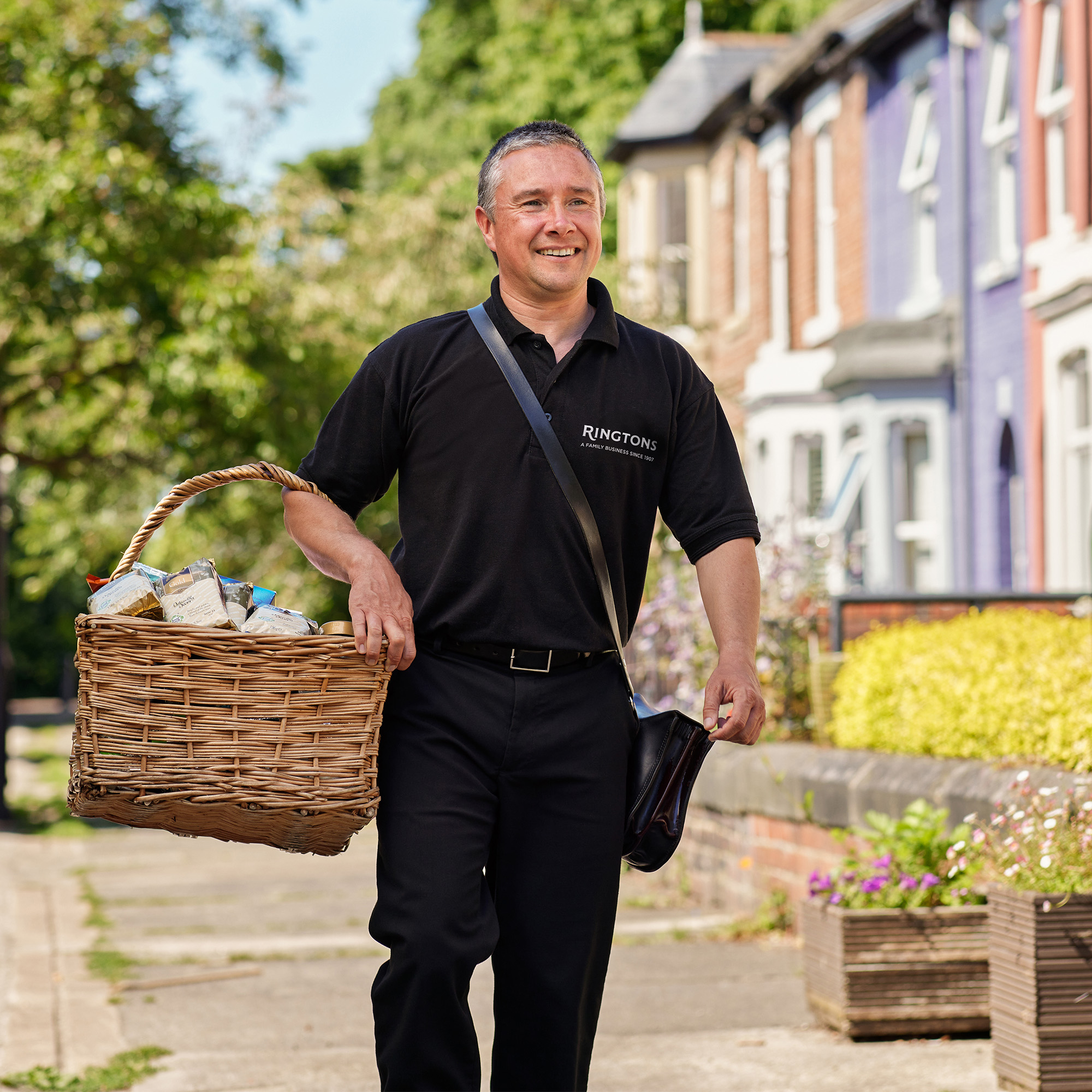
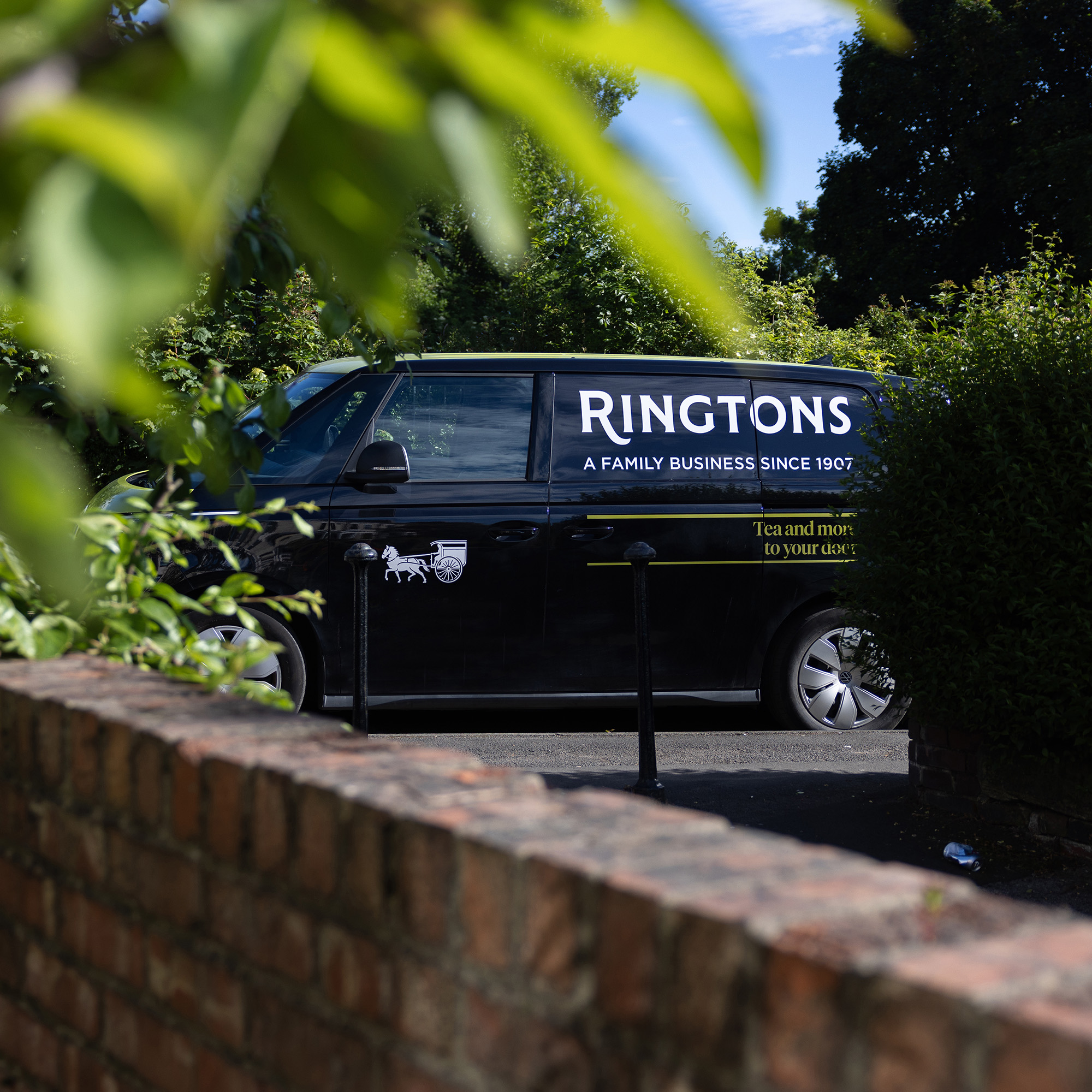
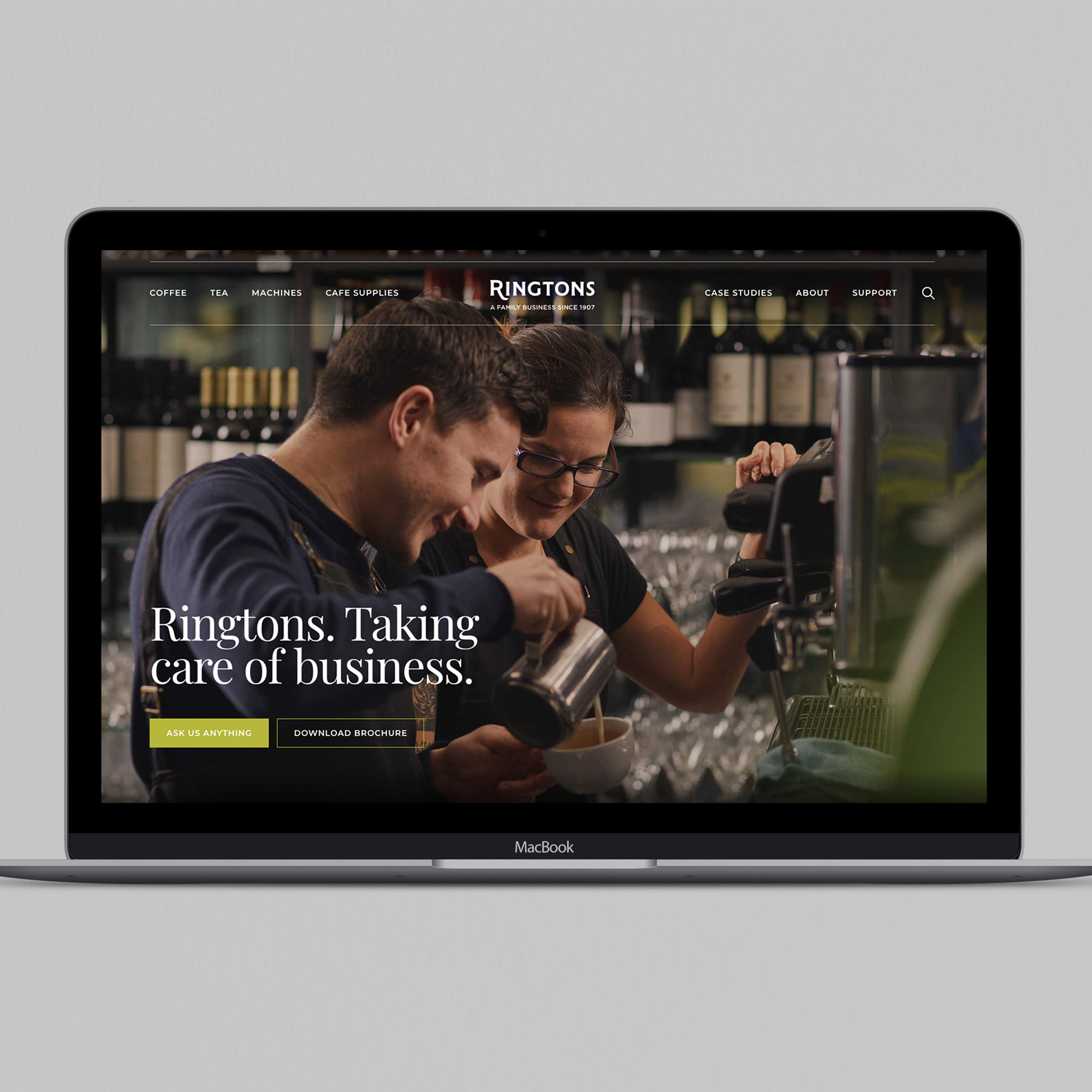
These elements come together to bring to life a brand that is caring, personal and dedicated to quality, from its sourcing to its delivery. A brand that is consistent across all its touch points – whether packing tea in the factory or fitting a coffee machine in a hotel. The new brand is now making its way into the world, with the launch of the new B2B website.
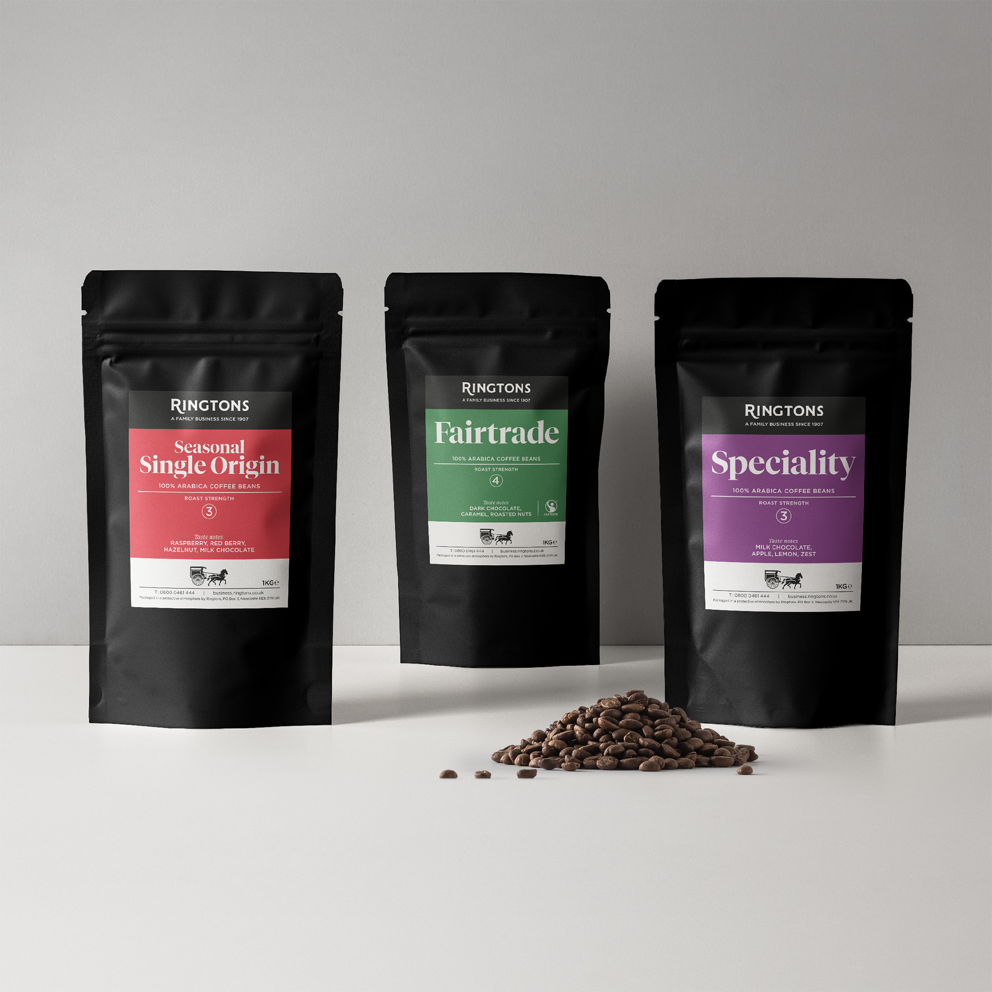
Designing the Ringtons’ B2B packaging was another greats aspect of the brief. We developed a system that delivers consistency and coherency to a variety of ranges and products. It’s recognisably Ringtons, through the uniformity of the word mark header and horse and cart footer, regardless of format and size. The hierarchy is simple and effective, so the content is easily located and understood. For this iteration, we used a rich, heritage colour palette, to denote flavour and bring warmth. There is more to come, with beautiful illustrations and the D2C range in the coming months.
To see more of our work with long-established brands, read our Dicksons case study.