Life Factory
Services
Brand identity
Impact
- Brand evolution
- Brand strategy
- Renewed sense of purpose
Story
Founded in 2008, Life Factory set out to make wellbeing in the workplace more than just a ‘nice-to-have’. Their ambition was simple but bold: a world where good workplace health is the norm, and where employers and employees alike can aspire to better wellbeing and a healthier work-life balance.
Working closely with the founder, we developed a new strategy and rebrand rooted in empathy and encouragement. Conversations with Life Factory’s audiences helped us understand the real pressures people face at work, shaping the idea of the brand as a ‘wingman’ – an empathetic partner that supports people so they can take care of business. This gave us a clear steer on tone and character, moving the brand away from cold, technical cues and towards something warmer and more human.
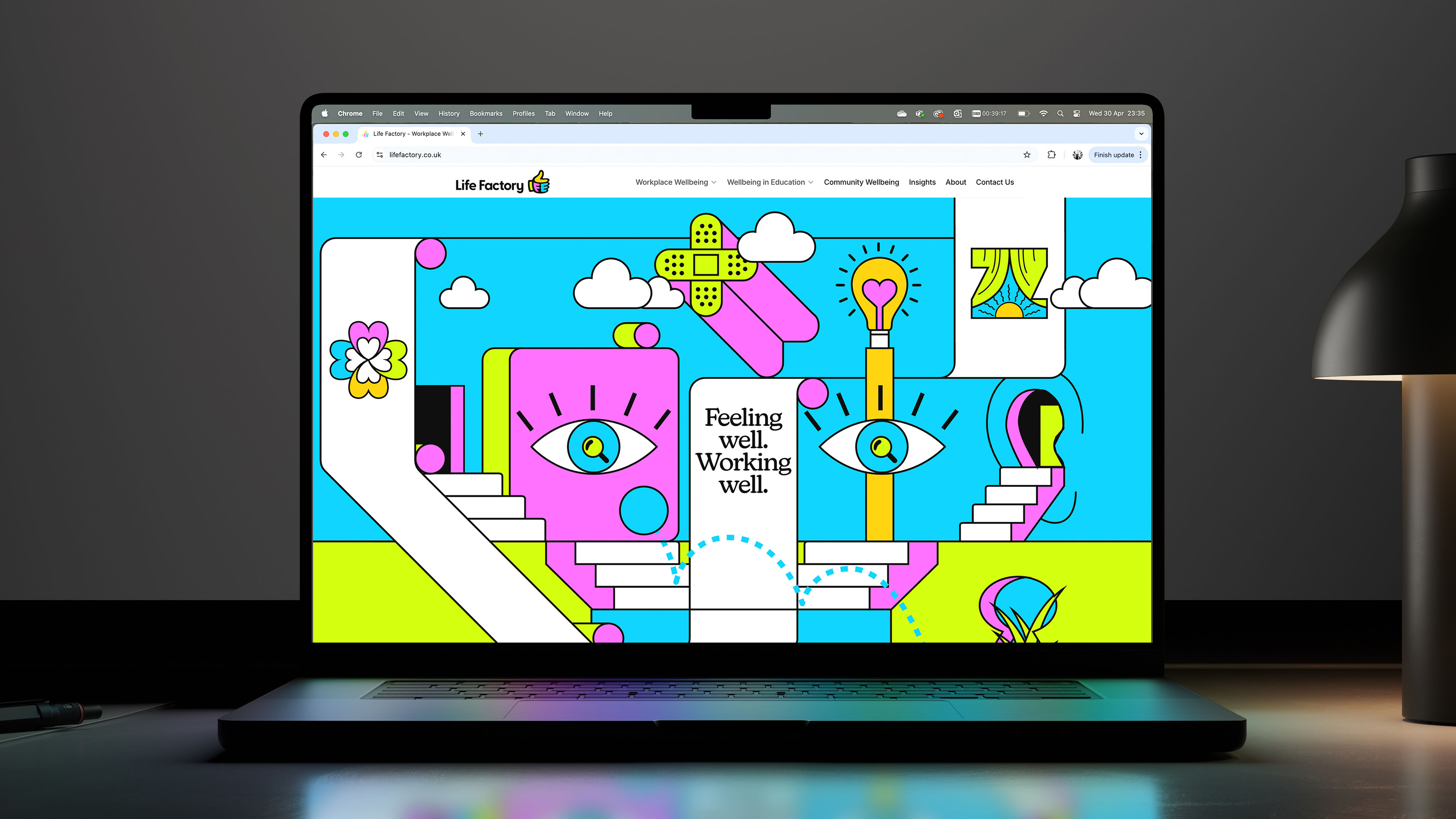
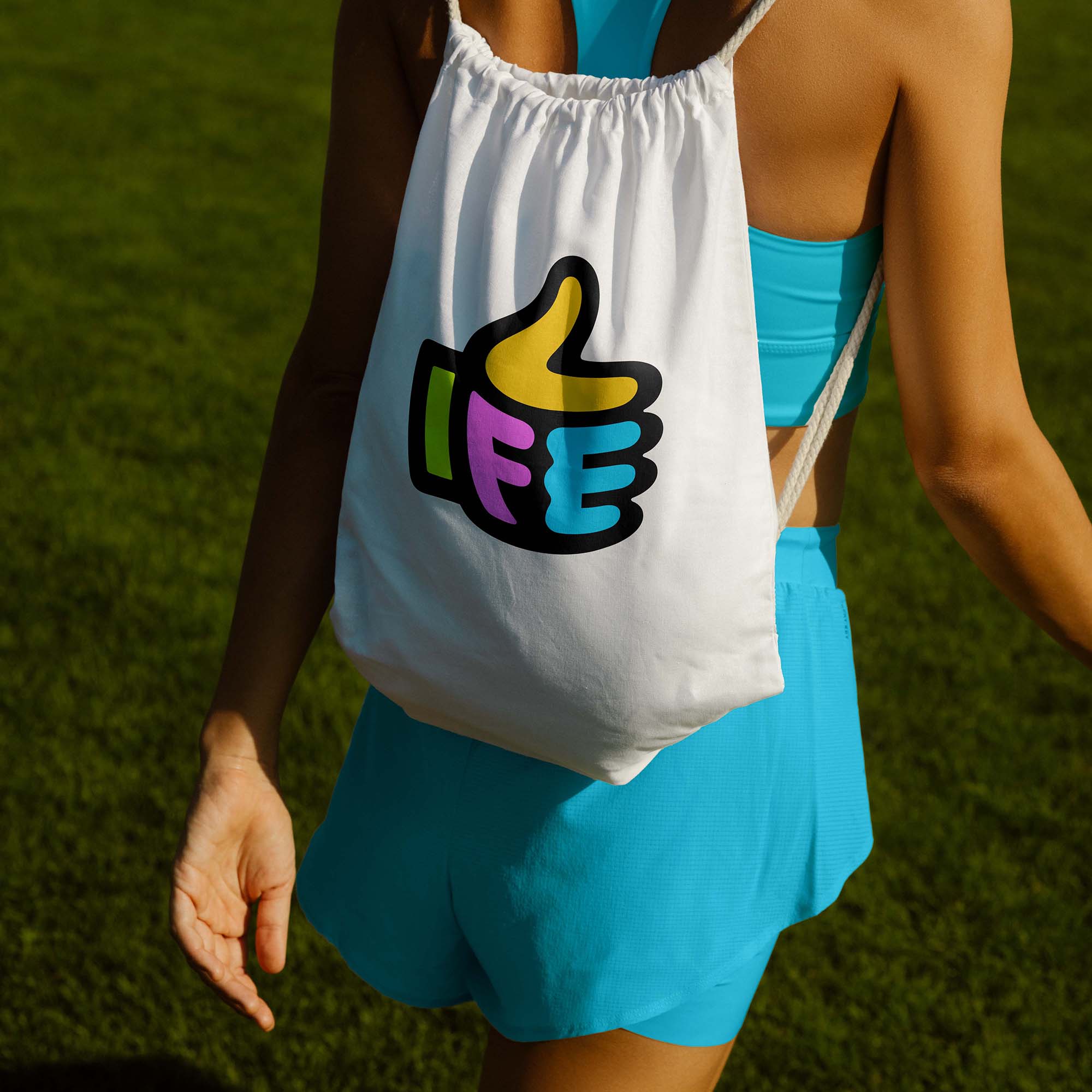
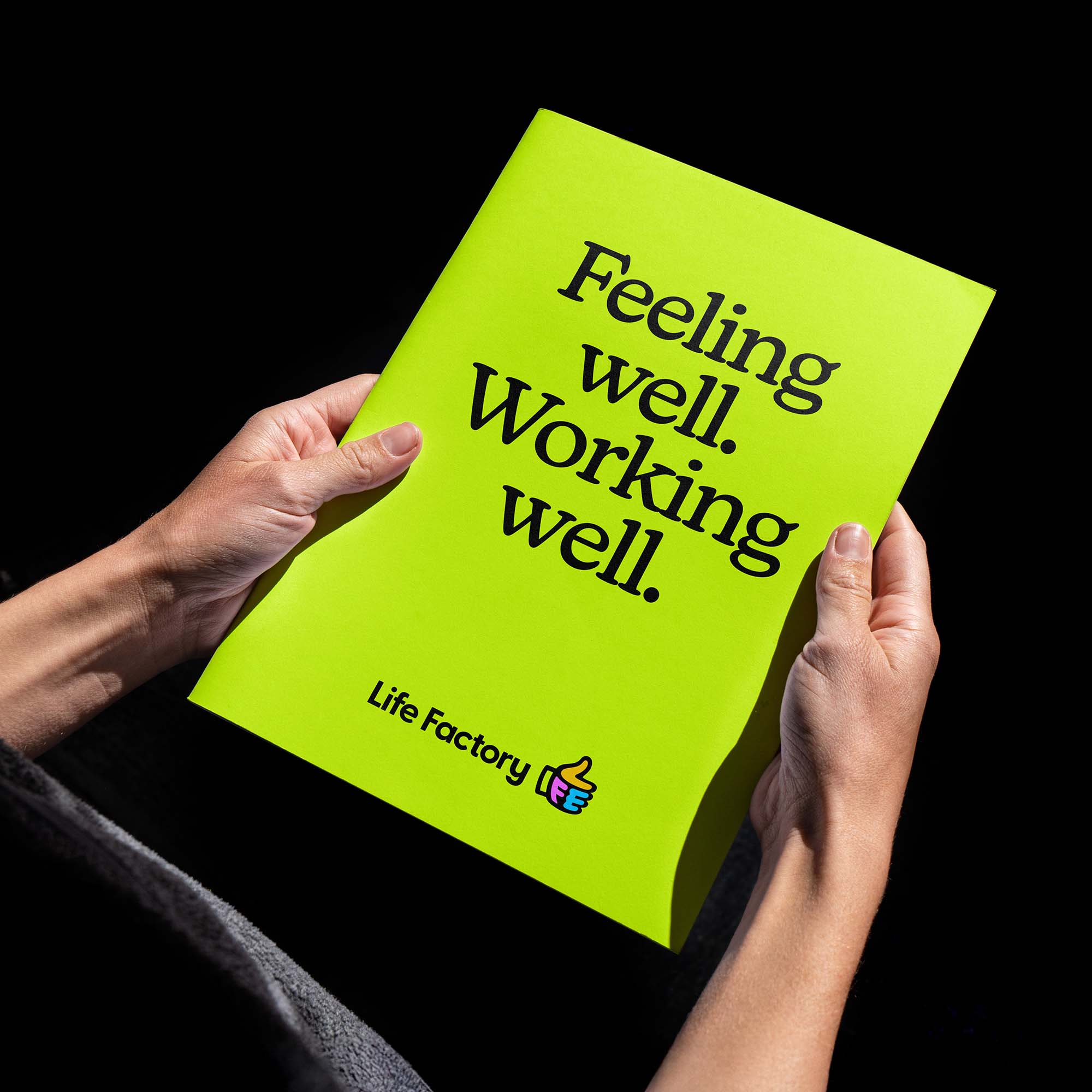
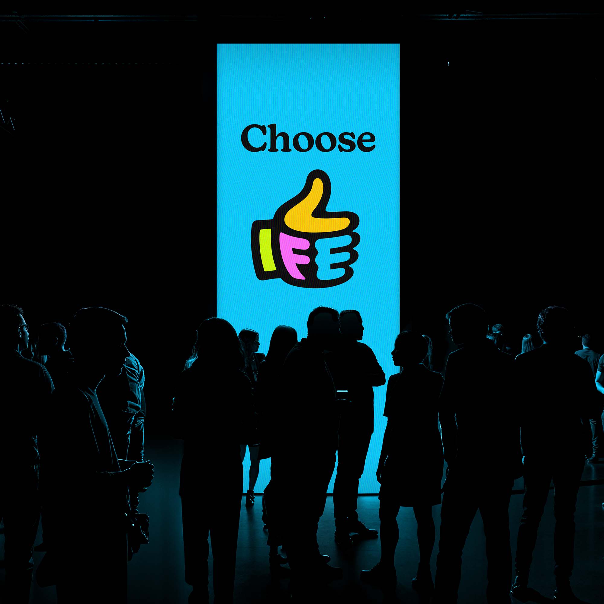
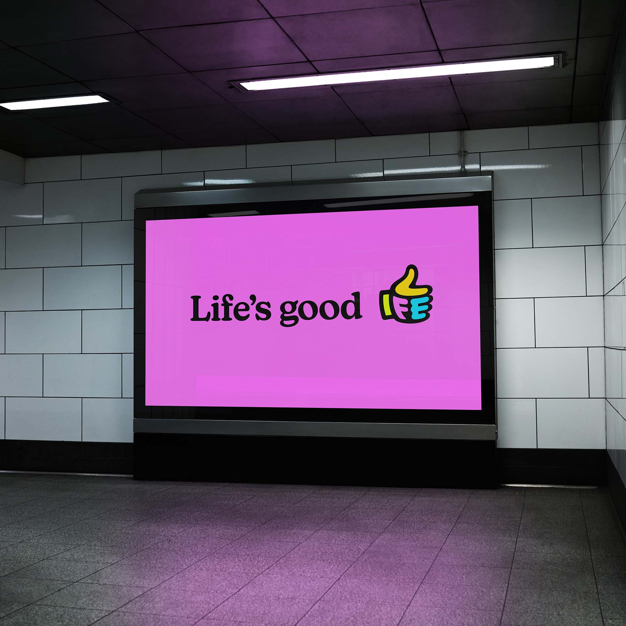
The new identity centres on a simple, universally recognisable ‘thumbs up’ icon. It instinctively reflects positivity, reassurance and proactive support, while subtly embedding the idea of ‘life’ at the heart of the brand. A more surreal and open-ended illustration style was introduced to address sensitive wellbeing topics without stigma, leaving space for interpretation rather than prescription.
By moving away from tired ‘head in hands’ imagery and embracing a more human, encouraging visual language, Life Factory now presents wellbeing in a way that feels approachable rather than intimidating. The rebrand gave the business a clearer voice in a crowded market and a shared sense of direction internally.
The founder and team felt confident standing behind the new identity, using it consistently across communications and conversations with clients. It helped align everyone around a single purpose and language, making it easier to talk about wellbeing in a way that felt natural, positive and true to the business.
Most importantly, the rebrand reinforced Life Factory’s original ambition, supporting real people in real working lives and gave the team a distinctive identity they could grow with.